
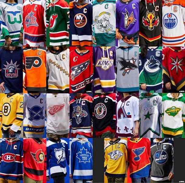
Old is New Again
Noah Adler

Sure, things here in Flames land are looking pretty bad right now. To lighten the mood, I got a fun article for this week on our substack.
With the 2020-21 regular season nearing its climax. I go over some of the teams that I honestly believe should return to their roots as Home and Away or use their RR as an alternate going forward
Anaheim Ducks:
Current home and aways with the D are brutal, the piping and striping awful, the colours yuck, but with their Reverse Retro they released returning to Wild Wing, it is 100% their best jersey currently and ain’t close. What they need to do however is bring back Mighty Ducks, original colours, everything back full time.
Arizona Coyotes
As my former co-host Mike Gould (@miketgould) said, the Coyotes as their current home and aways consist of Brick Red. Just looking at the design, I have no idea what is happening, the piping is weird, the striping also looks weird. They wore the Kachina 23 times at home, along with their Reverse Retro 5 times. It is sounding like a White Kachina is down the pipe and should be in their fold pretty soon, but yes 100% the Coyotes need to be back to Kachina’s full time because that is the best jerseys they’ll ever have.
Boston Bruins
I don’t hate the currents they have but I think Boston need to return back 70s home and away sets, that and also free Pooh Bear, bring it back as a third.
Buffalo Sabres
The Sabres are a dumpster fire organization. The only good thing with the Sabres this season has been their jerseys. In saying that, its not the route I would have gone to be honest by bringing back originals, there’s something about the red, black and silver of goathead that sticks out to me more than the Blue, Yellow and White originals, so whether it is an alternate or full time home and away basis, Buffalo do a majority a solid and bring back the goatheads.
Calgary Flames
Here’s the thing when it comes to my Flames. Its not that I hate bringing back the Retros, however, to be honest I would have brought back ‘04s before the Retros. This might be my childhood and ‘04 nostalgia talking here, but what bringing back Blasty also proved, is that the chevron stripes…..KILL…..hopefully Blasty as full time third starting next season, and also if there were to be another Reverse Retro series, a Black Pedestal would be slick.
Columbus Blue Jackets
What I would love for the Jackets to do is go back to their originals with the bug head on shoulders, and also do a bug head jersey.
Dallas Stars
This will give Saber fans PTSD when I say it, but Dallas needs to move away from the light green and go back to their Stanley Cup winning jerseys full time. I did like the intention they had going into the Reverse Retro, but the final product perhaps is the worst and ugliest one released.
Edmonton Oilers
Now I'm not saying it cause its the Oilers, but I do not understand their obsession of using Orange in their jerseys (*cough orange crush cough*). Only jerseys the Oilers have ever had that I would call exceptional, is the navy blue, copper, red and white jerseys that they wore on route to Game 7 of the ‘06 Finals, along with the Todd Mcfarlane Oil Drop alternate which I think they missed a huge chance to bring it back and turn it into a white version as their Reverse Retro.
Florida Panthers
I'm not saying I hate what they have now or that its ugly, but Florida did a solid job with their reverse retros and for one I don't understand why that flying Panther still is not their current main logo, but especially with the palm trees as shoulder patch, they need to move back to their originals full time but with current colour scheme that they use.
New Jersey Devils
You could consider the current Devil jerseys to be among worst in the league, I love the Red, Black and White, but for me its again the piping, stripes, design elements, just looks terrible. They need to return to the clean crips, glory year that Marty Brodeur and Scott Stevens rocked on route to three championships.
New York Islanders
Now I know a lot of people were extremely disappointed that the Isles didn’t go down the Fisherman route. I will say this, in the context of RR, this one sucked, however it is a jersey that I think would work as a home and away, and yes also bring back Fisherman as third.
New York Rangers
I know Makayla won’t agree with this one, but Lady Liberty full time home and away. The RR of it is pretty boring, but I honestly think it would work as a primary.
Pittsburgh Penguins
Hot Take: Robo Penguin full time. Would love to see Crosby rock Robo Penguin before he hangs them up.
San Jose Sharks
From their clean originals to the cool style they had in late 90s early ‘00s, San Jose I felt has had some underrated jerseys, I think their jerseys now are pretty boring, and they need to return to either the clean OG’s or the ones they wore from 1998-2007.
Tampa Bay Lightning
Currents now are way too close in similarity and looks like they are copying the Leafs. Now it pains me to say this but they should return to their original home and away sets they had when they lost in such heartbreaking fashion in the Finals….yeah never-mind…..but in all seriousness they should return to originals.
Toronto Maple Leafs
Honestly I don’t even have a problem with their currents. But their early 2000;s I like so much better, and honestly think they should bring those back full time…..oh and this might be a controversial one….but the Leafs need to do a cool third jersey….like idk maybe a Polar Bear head jersey.
Vancouver Canucks:
Their branding over the teams history has been weird to figure out, they start as a stick team, then they become a skate team, now for last 2 decades they’ve been a whale team, plus there have been many transitions of their colours, like who are the Vancouver Canucks?? If I was in charge of that department, I would bring back the stick but with a twist, stick with the skate colours.
Washington Capitals
Caps are the only team currently in the league to have same Home and Away set from when teams moved to Reebok Edge back in ‘08. Like a lot of them, Washington ain’t any different in how awful the piping and striping was and stil is, however they will always get the love cause won Cup in those. But it’s time for a change in D.C., bringing back the Screaming Eagle as Reverse Retro with current colour scheme, Ovi gonna rock that beauty with confidence, they absolutely need return to them with current colour scheme.
Honourable mention:
Seattle Kraken:
Haven’t played a game yet, they killed their home and away uni’s. As for an alternate, I would love for them to go down the 1917 Stanley Cup Champion Seattle Metropolitans road, but make some tweaks to the jersey using current colour scheme.
Like I said in the beginning, I really hope after the latest series of jerseys that teams go back and re-explore their roots. What do you guys think, agree, disagree, netural??